In my last chapter i.e. "Silverlight Tutorials Chapter 2: Introduction to Silverlight Application Development" we discussed on how to create a new Silverlight project, the structure of the project solution and later in this chapter we discussed on UserControls and various ways of development. After reading that chapter you are now comfortable to create Silverlight application and UserControls for your application.
Today I am publishing the 3rd Chapter i.e. "Introduction To Panels". In this Chapter I will describe about different Panels available in Silverlight. After reading this chapter you will be familiar with various types of Silverlight Panels. As this tutorial is mainly targeted for Silverlight 4, hence you will find some panels unavailable in the earlier versions of Silverlight.
Overview of Panels
There are total six numbers of panels available in Silverlight. They are as below:
- Grid
- Canvas
- StackPanel
- ScrollViewer
- Border
- ViewBox
You will find Grid, Canvas, StackPanel and Border as most useful panel while you start working with them in your Silverlight application. Let us discuss about those in depth.
“Grid” Layout Panel
The Grid layout panel is the most useful panel you ever use. This is the default panel inserted inside every xaml when you create a UserControl. When we created our first Silverlight example or even the first UserControl, you noticed that there was a Grid panel named “LayoutRoot” where we created Rows and Column definitions to place our control to create the Employee View.
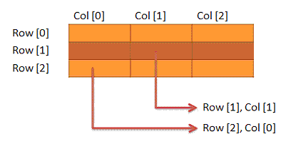
The Grid layout control allows you to define the Grid structure to place individual elements as Rows & Column structure in Matrix format. Once you divide your Grid panel in Rows and Columns you can place your element in the appropriate cell by using Grid.Row or Grid.Column property.
See the Grid structure in the below image:

“Canvas” Layout Panel
Canvas is the simplest layout available in Silverlight. It is very easy to understand and using this you can place any content any where inside the canvas. Not only this, you can also layered your application and by layering you can put your content front or back of any other control.
You can think Canvas as a HTML div Tag, where you can put your content in specific location by providing absolute left and top position. Have a look into the below image to get a brief idea on the same.
Lets think there are two Rectangles placed inside the Canvas as mentioned in the above figure. The first Rectangle (Blue one) is placed at the (10, 10) position. This is the coordinate location of your first Rectangle. First one stands for “Left” and second one stands for “Top”. So, What is the coordinate position of the second Rectangle (Orange one)? Exactly, it is Left =50 and Top = 30 i.e. (50, 30).
I think it is the right time to go for writing a sample code to create the above canvas with two Rectangles inside it. I am pretty much confident that, you have now a good confidence on the Canvas positioning.
“StackPanel” Layout Panel
StackPanel is one of the most important panel in Silverlight. You will find it useful when you want to show some of your Silvelright elements either Horizontally or Vertically. It has a property called “Orientation”. You can set it appropriately as per your requirement.
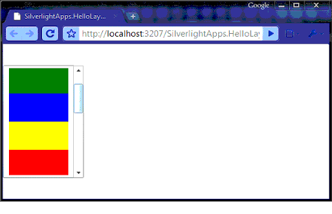
Once you add some elements inside StackPanel, you will notice that they will place as a Stack on top of each other. Have a look into the following figure to get a clear understanding of the same.

“ScrollViewer” Layout Panel
ScrollViewer is another layout container, which you will find interesting in some cases. Though it is not require to use in all the scenarios to hold elements but to show contents inside a scrollable panel like ListBox or Editor window you have to use ScrollViewer. ListBox, TextBox, RichTextBox internally uses ScrollViewer to implement the scrolling functionality.
Now come the question of implementing the scrollviewer functionality to our previous sample of StackPanel demo. If you add more Rectangles in the Vertical StackPanel in the previous demo application, you will notice that the rectangles are cropping inside the StackPanel as it has a fix height of 100.

“Border” Layout Panel
It’s an another type of Layout Panel in Silverlight. But as like other panels it can’t contain multiple contents in it. Border supports only one child as a content. If you want to use Border as a container of multiple controls, you have to wrap those with anyother panel like Grid, Canvas etc. and then place it in the Border. So, what is Border actually? The name says it. It is a border. If we want to add some border in our Silverlight application, we can use it at that time.
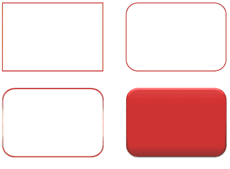
Look into the following figure. Here you will see four different shapes. These shapes you can create using Border element. You can create your border filled with Solid color or Gradient color or you can use a transparent color.

After seeing the above figure, I think one question came to you mind that “I can create the same thing using the Rectangle too. Then what is the benefit of using Border?” Yes right. You can create the same thing using Rectangle too as we did earlier, but the main difference is “You can create a rounded corner shape using Border. It has the property called “CornerRadius”. If you set it to 45, means your shape will have a corner radius of 45 degree.
“ViewBox” Layout Panel
ViewBox panel is another useful panel in Silverlight. It is actually not a new panel in Silverlight. It was available in Silverlight 3 toolkit, but Microsoft added it in the Silverlight 4 runtime for it’s demand. You can use ViewBox panel to stretch and scale a element control. Like Border it also has only and only one child. If you want to set more than one child, you have to use any other panel inside the ViewBox to hold other children controls.
As I told earlier, you can stretch and scale your control inside your ViewBox. It has a property called “Stretch” which has the following values:
1. Fill:
If you set the Stretch property to Fill, the content will fill the entire space of the ViewBox. It doesn’t preserve the aspect ratio.
What next?
Soon you will also read Chapter 4 (Introduction to Controls), till then keep learning.
Have a question? Or, a comment? Let's Discuss it below...
Thank you for visiting our website!
We value your engagement and would love to hear your thoughts. Don't forget to leave a comment below to share your feedback, opinions, or questions.
We believe in fostering an interactive and inclusive community, and your comments play a crucial role in creating that environment.
